REDESIGNING BATHING BEAUTEAS’ PRODUCT LANDING PAGE
Empowering a Seattle wellness & lifestyle brand with a fresh rebrand and responsive website that increased sales by 300%.
Stressed? Try taking a tea bath.
Bathing Beauteas is a wellness and lifestyle brand based in Seattle known for its handcrafted fragrant tea baths.
The e-commerce brand brings the pampering spa experience home as an effortless and healthy way to reduce stress.
In addition to encouraging rest, Bathing Beauteas commits to their social impact mission to donate a portion of proceeds to local nonprofits who support survivors of sex trafficking.
Welcoming a new wave of consumers.
When they launched their business in 2015, Bathing Beauteas created a Shopify e-commerce with no previous experience.
By March 2018, the brand was approached with an opportunity to do a television segment with King 5 News to reach a wide audience, set to air in July.
I decided to focus my efforts on revamping the product landing page before King 5 New’s airing date to anticipate the large incoming volume of new clients.
Duration
6 weeks
Team
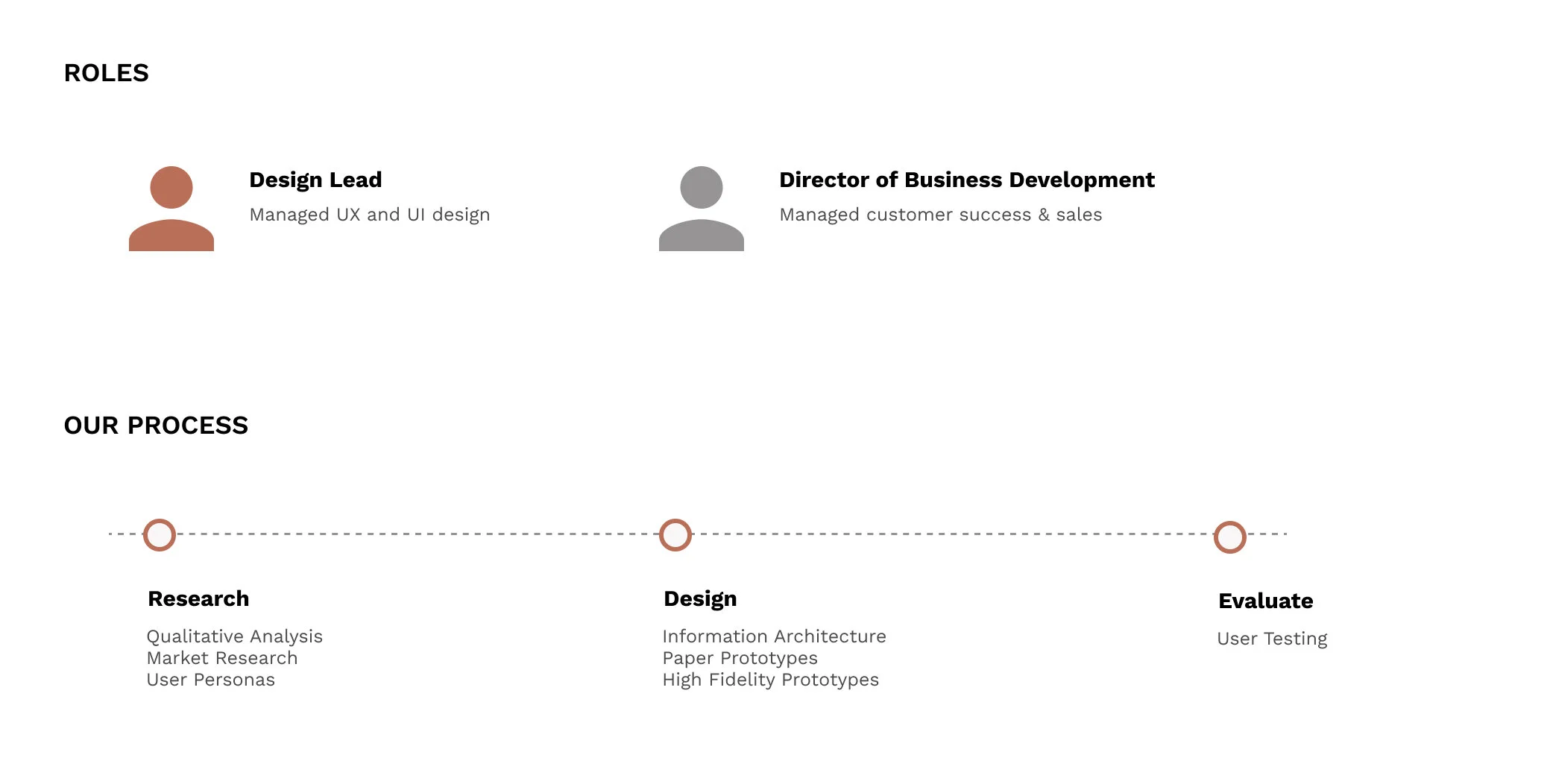
Co-Founder & Myself
Role
Design Lead
Visual Designer
Product Manager
Key Skills
UI/UX Design
Product Photography
Graphic Design
User Research
Prototyping
Tools
Sketch
Squarespace
Figma
Bathing Beauteas’ first attempt at branding and web design was not an accurate representation of the high quality products they offer their clients.
I worked with Bathing Beauteas’ Co-Founder / Director of Business Development to turn the cluttered and confusing page into a functional landing page in time for the upcoming King 5 promotion airing date.
I decided to craft a new landing page on Squarespace for its superior design and content management services as well as more intuitive e-commerce features.
Defining User Personas
Initially, I led my team in conducting 200 interviews in-person and using Google Surveys to create four customer personas to detail the needs and expectations of different client groups. This helped guide all our design decisions moving forward.
Our research and insights for the purpose of this landing page redesign can be highlighted as shown:
Understanding user pain points
During the research phase, I conducted 15 structured user interviews to get insights on the website. I also designed and rolled out a survey to understand the user pain points.
A bad welcome page could mean losing out on huge potential sales if clients cannot find the information they are looking for. I gathered initial responses to the landing page to identify existing pain points.
💡 Visual Audit: Consistently Inconsistent
Looking through the website it was clear that consistency needed to be improved. The website contained a number of different fonts, colors and busy images which distracted from the overall message and hindered the website's functionality.
Text color contrast was illegible and did not support usability
Key information was difficult to scan with the busy visual backdrops, resulting in an ambiguous hierarchy of importance
Weak copy does not elaborate on product benefits and brand story
Defining Project Goals
My goal was to understand the full user experience of a customer visiting Bathing Beauteas’ landing page and map a journey that guides the user through the product overview.
💡 TL;DR: Users need a simple, yet impactful information hierarchy on the landing page to navigate the products, key values, and benefits.
Defining Business & Marketing Goals
Bathing Beauteas wanted to use the increased traffic from King 5 News’ promotion to help improve and maintain high conversion rates.
With the updated landing page’s new features, the brand hoped to further engage new users beyond sales including additional content such as blog articles, a behind-the-scene video, and a newsletter sign up option.
💡 Note: Bathing Beauteas can improve conversion rates and encourage retention by introducing engaging content that allows users to explore brand transparency and authenticity.
Who does Bathing Beauteas compete with?
Bathing Beauteas has a first mover advantage, as tea baths are a largely untapped market opportunity.
Large retailers like Lush and Bath & Body Works have a diverse product offering, but lack focus on tea-infused products. Etsy artisans create tea baths, but without a luxury feel and significant scaling potential.
Its niche focus is on tea infused products, local sourcing and production.
Rethinking the Brand Style Guide
Bathing Beauteas had a well established design system in place, while also encouraging me to test the boundaries and be creative. The new landing page must visually convey the elegant and restful lifestyle that customers seek.
This includes:
Soft and soothing colors to evoke a sense of calmness and elegance
Clean and sophisticated fonts to match the brand’s minimalist look
High quality product photography for optimized visual storytelling
*Bathing Beauteas logo design and product photography by Stephanie Mai
💡 Note: Bathing Beauteas’ focus on relaxation and dignity is reflected throughout their branding. Hence, outside of products, photography focuses more on faces and hands instead of nudity and other sensual themes.
Improving the IA
I designed a new site map for Bathing Beauteas. As a multifaceted lifestyle brand, Bathing Beauteas offers exciting services and content beyond its product offerings. The following were solutions to combat the previously limited navigation:
To indicate an equal hierarchy of importance, I included “Classes,” in the primary navigation for the brand’s virtual hand lettering courses.
Organized drop down menus are added to further explore the brand and browse important options such as wholesale and bulk purchases.
Extended brand content allows for more transparency behind the brand. Users can explore details behind brand philosophy and social impact.
Thinking Through
the User Flow
User testing revealed that the original landing page was difficult to scan, so I focused on created variations to see what layouts and elements feel innate to users.
Some key findings:
1) Product pictures could look confusing and messy depending on how you place it
2) Too many videos or animations are not preferred
3) Placement is key when navigating text blocks
A Look At the Initial Wireflow
I kept these themes in mind while iterating concepts for the mockup. I aimed to design a product that not only made users happy, but one that Bathing Beauteas would appreciate as well.
Final Design
My goal was to design a simple, friendly experience that would help build trust and inspire users to make purchases. The new landing page displayed a cohesive combination of improved brand graphics plus new interactions that served to hold the user's attention. Below is a look at the final build.
Prominent Announcement Bar
Many competitors featured an announcement bar with shipping or promotional info, providing clarity and incentive to users. A common industry theme, this announcement bar will help provide direction to both new and returning clients of Bathing Beauteas.
Definitive Hero Image
For the hook, I tried to make it 100% clear what product was going to be offered with a very definitive hero image. The page greets users with a clear brand narrative, value proposition, and call-to-action.
The timed slider also introduces additional featured products and brand promotions to provide clarity and build trust.
💡 Note: I utilized my photography and editing skills to help Bathing Beauteas strategize and execute new high quality product photos for their website.
Short Interactive Video
Users are greeted by the faces behind Bathing Beauteas. The landing page’s automatic clip helps capture users’ attention and shows the founders and intern team making products together. This gives users a peek behind the process and meet the makers of the brand. Friendly faces and brand transparency can help users feel welcome.
💡 Watch: Click to watch Bathing Beauteas’ intern team behind the scenes!
Additional Brand Value
Secondary offers such as Bathing Beauteas’ calligraphy workshops and blog invites users to explore the brand further. Here, the combination of white space and legible text color improves the accessibility of visual hierarchy and user focus.
I ensured an inclusive brand tone as well as a breakdown of the value proposition to help build a clear brand narrative and inspire user trust.
💡 Note: I used this opportunity to highlight Bathing Beauteas’ social impact work of donating a portion of proceeds toward local nonprofits that support survivors of sex trafficking.
King 5 News’ Testimonial
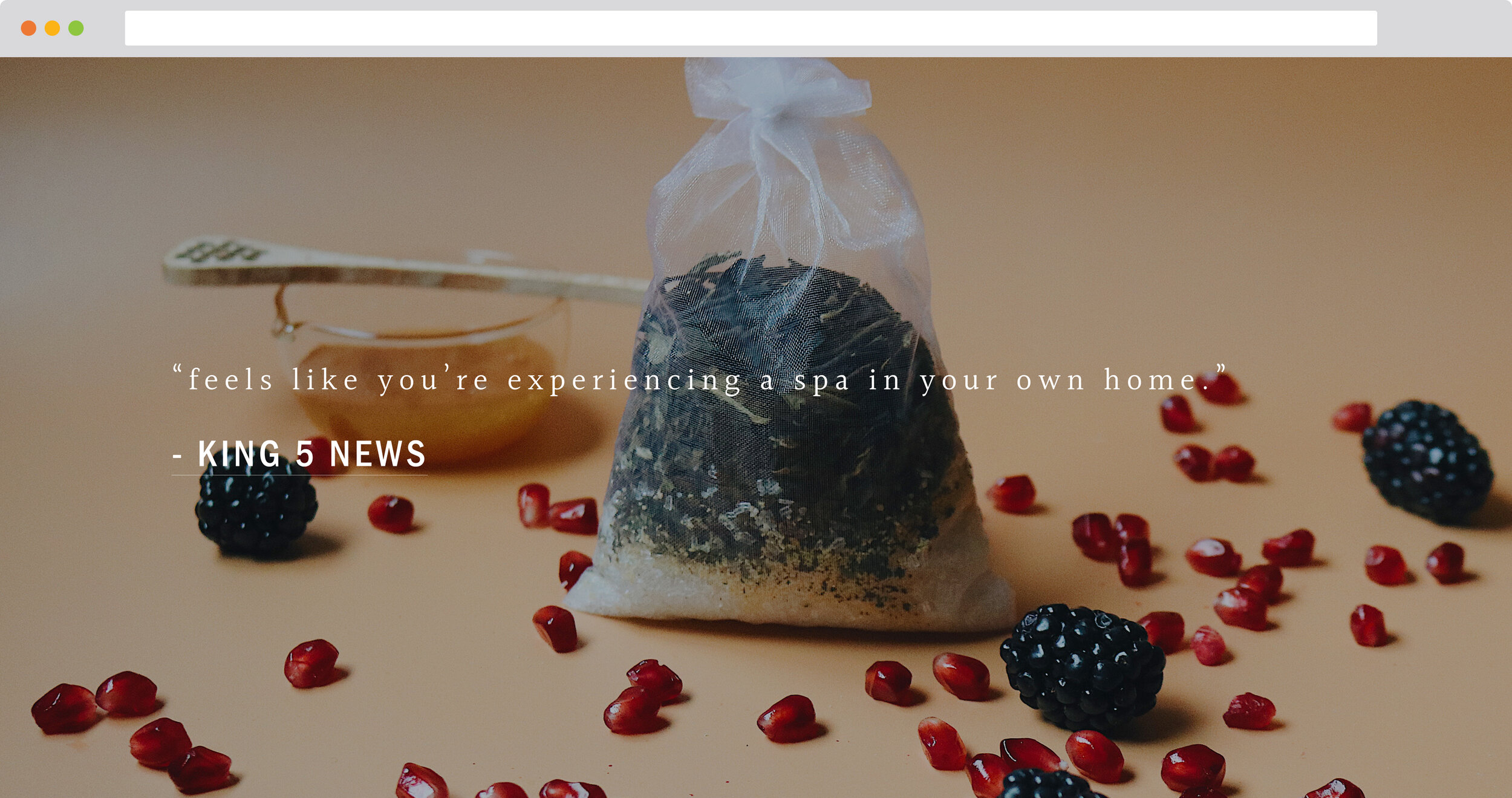
Users are more likely to trust brands with product ratings and testimonials. I aimed to reduce friction by linking King 5 News’ video directly and adding a quote from the clip to help highlight Bathing Beauteas’ product and story.
Unlike the first automatic clip, users can view the link on another tab to prevent lagging the landing with too many animations and large visuals.
Utilizing the Footer: Tools for Increasing Engagement
To help achieve our goal of increasing engagement, I made sure to:
Prompt users to input their contact information in exchange for a first-time purchase discount is a valuable incentive.
Encourage users to connect on Instagram with beautiful product and lifestyle imagery.
Provide additional channels for questions and partnership inquiries such as email and Facebook links through clear social media icons.
Results
The second iteration of the Bathing Beauteas landing page had the exact results we’d hope for. Our team measured the results through Squarespace’s e-commerce platform and found:
300%
68%
Increase in sales in 30 days
Measured through monthly sales analytics
Increase in Engagement
Measured by user navigating to
blog and social media links
10%
Increased Daily Traffic
Measured by users navigating at least one source
33%
Shop Conversion
Measured by users making at
least one purchase during visit
Overall, I felt incredibly proud of these achievements. We not only exceed our design and sales goals for my this project, but the traction allowed Bathing Beauteas to continue to grow and build from this momentum long-term after the launch.
Welcoming A New Wave of Users
Immediately after the segment aired, we saw thousands of users visit Bathing Beauteas’ website, continued to see high traffic over the following weeks.
The improved navigation and hierarchy led to increased sales and engagement unlike any the brand had received before. Using this momentum, Bathing Beauteas was also able to establish new wholesale partnerships and launch new products to the high traffic.
💡 Watch: Click to watch Bathing Beauteas on King 5 News!
Reflection
I am very proud of my first design project and its impact on Bathing Beauteas. It is empowering to help users rest and rejuvenate by introducing them to our tea baths. This project taught me so much, including:
Takeaways
Flexibility is key. The time constraint was initially tough to work with, I managed to iterate and sketch efficiently through rapid prototyping.
Communicate design changes frequently and efficiently to the team. Working so closely with my co-founder from the start allowed us to align our goals early on and discuss potential constraints.
Receive honest, constructive feedback during weekly design critique sessions. Together our team discussed our decision-making process, refined our prototypes, and explored new ideas.
Further Development
Without the time constraint, I could have improved the shopping experience with features such recovering abandoned shopping carts.
Highlight sustainable sourcing initiative. Bathing Beauteas sources its raw materials from local businesses to help reduce carbon output.
Add an interactive tea bath blend quiz to help users discover their preferred fragrance blend and familiarize with current products.
The possibilities are endless!
Feedback on the design? Want to chat over coffee about design or
e-commerce websites? Find me on LinkedIn.


